

Redesigning your Walnut Creek home’s kitchen has many benefits, such as enhancing functionality, improving aesthetics, and potentially increasing home value. You can match a new paint color with your tiles to achieve a cohesive and well-designed look for your kitchen.
The right combination of paint and tile can significantly elevate the kitchen’s overall aesthetic, enhancing not just the walls but also the cabinets and trim. To find the perfect match, consider your kitchen tiles’ style, color, and material, ensuring that all elements work harmoniously together to create an inviting and functional environment for your Vallejo home.
Consider the style of your kitchen tiles
Traditional vs. modern tiles
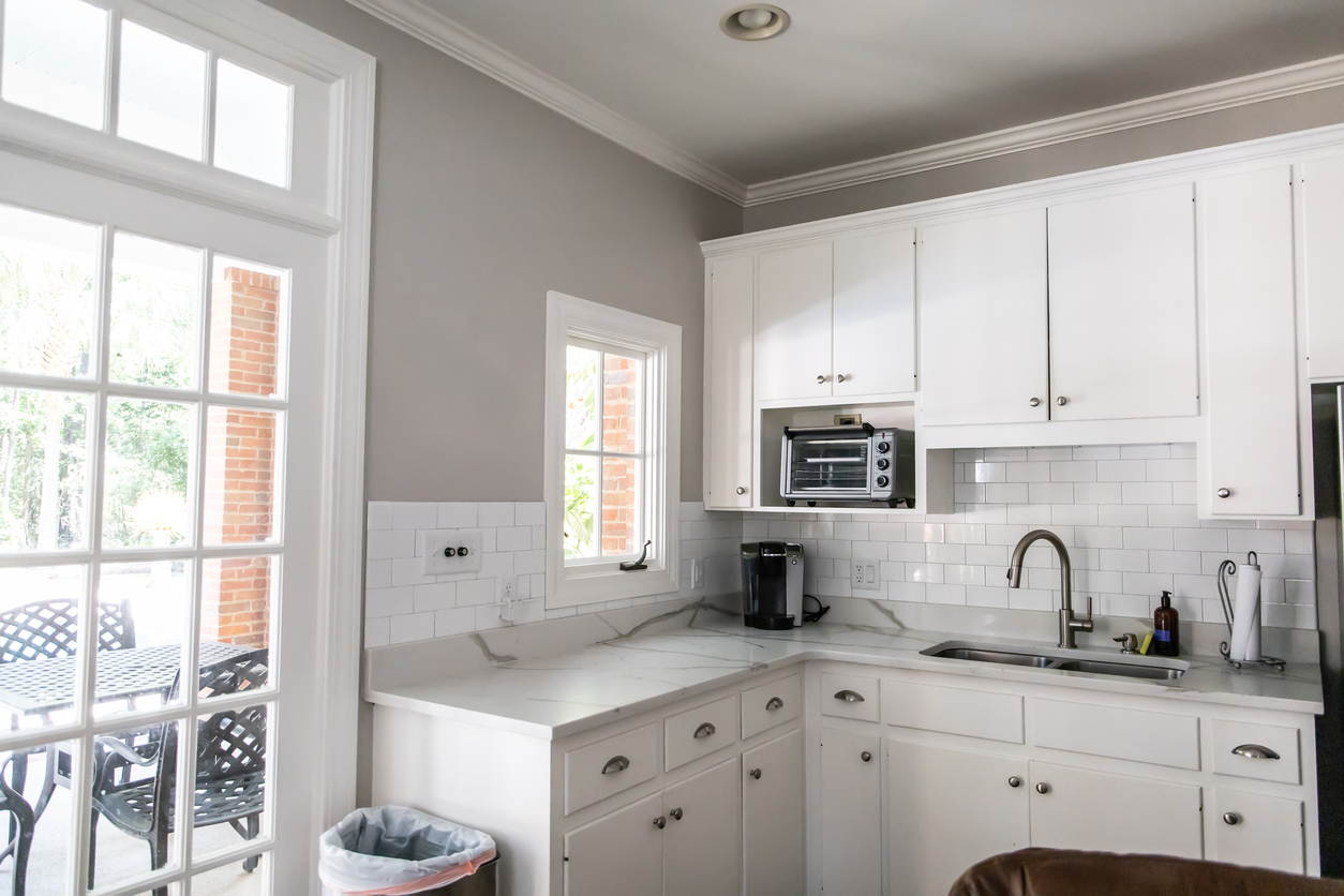
Traditional tiles, such as subway, mosaic, or terracotta, complement classic, neutral paint colors like whites, creams, or soft grays, enhancing a timeless aesthetic. In contrast, modern tiles—characterized by glass, geometric shapes, or sleek finishes—can support bolder, contemporary hues like navy, teal, or even vibrant accent colors, creating a striking visual impact.
Rustic and natural tiles
Rustic stone or ceramic tiles harmonize beautifully with earthy tones and soft neutrals. Warm browns, muted greens, or soft beiges can maintain a cozy and inviting atmosphere in the kitchen, emphasizing the natural textures and warmth of the tiles.
Patterned or decorative tiles
Intricate patterned or decorative tiles often benefit from simpler, neutral paint colors. This approach prevents the space from feeling chaotic or overwhelming, allowing the tile’s design to be the focal point while keeping the overall ambiance cohesive and balanced.
Choose a color palette that complements or contrasts
When selecting a color palette for your Lafayette home’s kitchen that either complements or contrasts with your tiles, consider the following approaches:
Complementary colors for cohesion
- Harmony with tiles: Choose paint colors that reflect the hues present in the tiles for a seamless, cohesive look. You can achieve this by selecting lighter or darker shades of the same color as the tiles, adding depth and maintaining visual consistency in the space.
Contrasting colors for bold designs
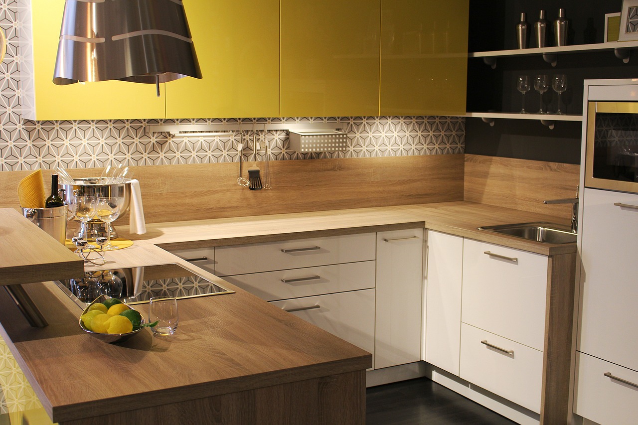
- Dynamic visuals: Choose contrasting colors to create a more vibrant and dynamic kitchen. For example, pairing dark cabinets with light tiles or vice versa can enhance the kitchen’s energy. Use the color wheel to find complementary contrasts—like blue tiles with yellow paint or grey tiles with teal—to ensure that the contrasting colors work well together while adding visual interest.
Match paint with tile undertones
Identifying undertones
Tiles often feature underlying tones that can significantly influence their appearance alongside paint colors. To effectively match paint, examine the tiles for their undertones—warm undertones might include reds, yellows, or browns, while cool undertones can be characterized by blues, greens, or grays. Recognizing these subtleties will help guide your paint selection to create a harmonious look.
Pairing warm and cool tones
Pair warm-toned tiles with warm-colored paint, such as earthy hues or soft creams, for a cozy and inviting atmosphere. Conversely, choose cool-toned tiles alongside cool paint colors like soft blues or muted greens for a modern and crisp aesthetic. This approach enhances the overall cohesion of the space and elevates the design.
Neutral colors: A safe and versatile option
Timeless neutrals for a clean look
Neutral paint colors such as whites, creams, greys, and beiges are excellent choices when you’re unsure about color matching, especially in kitchens with bold or patterned tiles. These neutrals create a clean backdrop, allowing the tiles to become the space’s focal point.
Layering neutrals with accents
You can enhance your Beniciam CA home’s kitchen neutral color scheme by layering with accent colors, such as painted cabinets or trim. This approach adds personality and depth to the design without overwhelming the space, ensuring a balanced and inviting atmosphere.
Using bold colors with subtle tiles
Making a statement with paint
When working with simple or neutral tiles like white subway or light stone, use bold paint colors such as deep blues, greens, or reds. This contrast adds energy and visual interest, transforming the kitchen into a dynamic space.
Balancing bold choices
To maintain harmony, use bold colors strategically—consider painting a single accent wall or cabinetry in a vibrant hue while keeping the remaining areas neutral. This approach allows the bold elements to shine without overwhelming the space.
Paint and tile texture considerations
When considering paint and kitchen tile textures, the interplay between the two can significantly enhance the overall aesthetic of the space:
Smooth tiles with matte paint
Pairing glossy, smooth tiles with matte paint creates an appealing contrast. The matte finish on the walls softens the look and prevents the space from becoming overly reflective, which can feel harsh and sterile. This combination also allows the glossy tiles to stand out as a focal point without overwhelming the design.
Textured tiles with soft finishes
Using satin or eggshell finishes is ideal for painted walls near textured tiles. These finishes offer a subtle sheen that enhances the visual interest of the textured tiles while maintaining a warm and inviting atmosphere. The soft shine of satin or eggshell complements the natural irregularities of the tiles, creating a cohesive and balanced look that draws attention without competing for it.
Coordinating paint for kitchen cabinets, walls, and backsplashes
Cabinet and tile harmony
When selecting cabinet colors, consider matching them with your kitchen tiles for a cohesive look. It creates a harmonious blend, making the space feel unified. Alternatively, complementary shades can add depth and interest while maintaining a seamless aesthetic.
Wall and backsplash coordination
For wall and backsplash coordination, paint the walls a lighter or softer color than the backsplash tiles to ensure the backsplash remains the focal point. Conversely, if the backsplash is subtle, consider a bold wall color. Aim for a color that ties the two areas together, avoiding stark contrasts to achieve a balanced design.
Testing paint samples with tiles
Testing paint samples with kitchen tiles is crucial for achieving a cohesive and aesthetically pleasing look.
Try before you commit
Before making a final decision, test paint samples alongside your kitchen tiles. It lets you see how the colors interact and ensures they complement each other. By sampling colors directly in the kitchen environment, you can assess how they resonate with the tiles, cabinetry, and overall decor.
Observe in natural and artificial light
Color can appear differently depending on the lighting. Observe your chosen paint samples next to the tiles under natural daylight and the artificial lighting typically used in your kitchen. This will help you ensure the colors harmonize well in various scenarios, preventing any mismatches that might affect the overall design once everything is installed.
When to hire a professional painter
When considering whether to hire a Vallejo area professional painter to match the paint color with kitchen tiles, there are two key factors to keep in mind:
Complex color coordination
Kitchens often feature multiple design elements, such as tiles, cabinets, and countertops, that need to be harmonized. Professional painters have experience navigating these complex color choices, ensuring that the selected paint seamlessly complements the tile and other materials. They can provide insights into color theory and help homeowners visualize the overall aesthetic, considering undertones and finishes that might not be immediately apparent.
Ensuring a flawless finish
Achieving clean lines and a seamless paint job is essential, especially around intricate tilework. Professional painters possess the necessary skills and tools to handle detailed areas without leaving gaps or paint bleed.
Their expertise ensures a polished final look, enhancing the overall appearance of the kitchen. This attention to detail can make a significant difference in the kitchen’s aesthetic, elevating the space and potentially increasing the home’s value.
Conclusion
Matching paint colors with kitchen tiles involves a thoughtful balance of complementing and contrasting while considering the style, texture, and undertones of the tile.
Homeowners are encouraged to experiment with various color palettes, test paint samples, and assess the kitchen’s overall design before making a final decision. Consulting a professional painter in Concord can also ensure a cohesive and expertly finished result, transforming the kitchen into a beautiful and functional space.
For professional house painting services, contact Custom Painting, Inc. today at 925-686-0903 or on our contact page to ensure a smooth, safe, and successful project!
